Giving presentations


STAT 550

Daniel J. McDonald

Structure

  1. Strategy (applies to papers too)

  2. Dos and don’ts

  3. Personal preferences

Strategy

Genre

Talks take many forms (like papers)

  • Department seminar

  • Short conference presentation

  • Class lecture

  • ...

Calibrate your talk to the Genre and the Audience

  • A job talk takes much more work than a class presentation
  • For context, after much practice, it takes me about 1 hour per minute of presentation length, depending on the amount of polish.
  • My course lectures take about 4x the target duration.
  • General ideas are the same for all styles.

Audience

  • Think about who you are talking to
    • Statisticians?
    • Students?
    • Potential employer?
    • People with PhD’s but in other disciplines?
    • Your grandma?
  • Regardless of the audience, I think of dividing the talk roughly in 3rds.

1.

Talk to your grandma. Why are you listening to me? Why is what I’m saying interesting?

2.

Talk to your audience. What have I done that you should be able to do at the end?

3.

Talk slightly over your audience. Why should you be impressed by me?

Part 3 is shorter depending on the Audience.

Content

Each part is a little mini-talk

  1. Starts with the general idea
  2. Develops a few details. Strategy: problem/solution or question/answer
  3. Ends with a takeaway

But these parts are recalibrated to the audience.

  • Your Grandma doesn’t want to see math.
  • Your employer might, but doesn’t want to hear about \(\sigma\)-fields.
  • Statisticians don’t want to see proofs (but might want a sketch).
  • ...

Story structure

What I often see…

Once upon a time, a young MSc student went into the woods of theory and found some trees. First they looked at one tree, it was oak. Then the looked at the next tree, it was maple. Then they wondered if trees could talk. After three months of wandering, they saw a house…

The attention grabber

Axe-wielding woodsman saves student from wolf attack!

  1. (Enough details to give the headline.)
  2. Headline result.
  3. How do we know the result is real. What are the details of computation, inference, methodology.
  4. Demonstration with empirics.

You should consider…

  • Attention span diminishes quickly.
  • What are the 3-5 takeaways?
  • Hit your main result at the beginning: this is what I can do that I couldn’t before.

The ideal map

Map out what you’ve done.

  • What did you find?
  • What are the implications? Why does audience care?
  • How do we do it?

Avoid wandering in the wilderness:

  1. First we did this;
  2. But that didn’t work, so we tried …
  3. But then we added …
  4. Finally we got to the beach …
  5. And the water was nice …

You left your audience somewhere in the wilderness.

Good resource

Prof. Trevor Campbell’s “How to Explain Things”

Dos and don’ts

Words

Too many words on a slide is bad

  • Bullet points
  • Too densely concentrated are bad
  • Are bad
  • Are hard to focus on


Empty space is your friend

Lorem markdownum et moras et ponendi odores, neu magna per! Tyria meo iungitur videt, frigore terras rogis Anienis poteram, dant. His vallem arma corpore vident nunc nivibus avus, dea. Spatium luce certa cupiunt, lina. Amabam opem, Iovis fecundaque et parum.

Conplecti videndo altum et hunc Iovi fronte maris, cur Aiax, iam fata morsibus, et. Aede virum annis audit modo: meus ramis videri: nec quod insidiisque Aonio tenuem, AI. Trames Iason: nocent hortatus lacteus praebita paternos petit, Paridis aptus prius ut origo furiisque. Mercibus sis nullo aliudve Amathunta sufficit ululatibus, praevalidusque segnis et Dryopen.

Images

Pictures are good


Flow charts are good.


Careful use of colour is good.


Size is good.


too much variation is distracting

How long did you stare at the cat?

Personal preferences

Graphics

Important

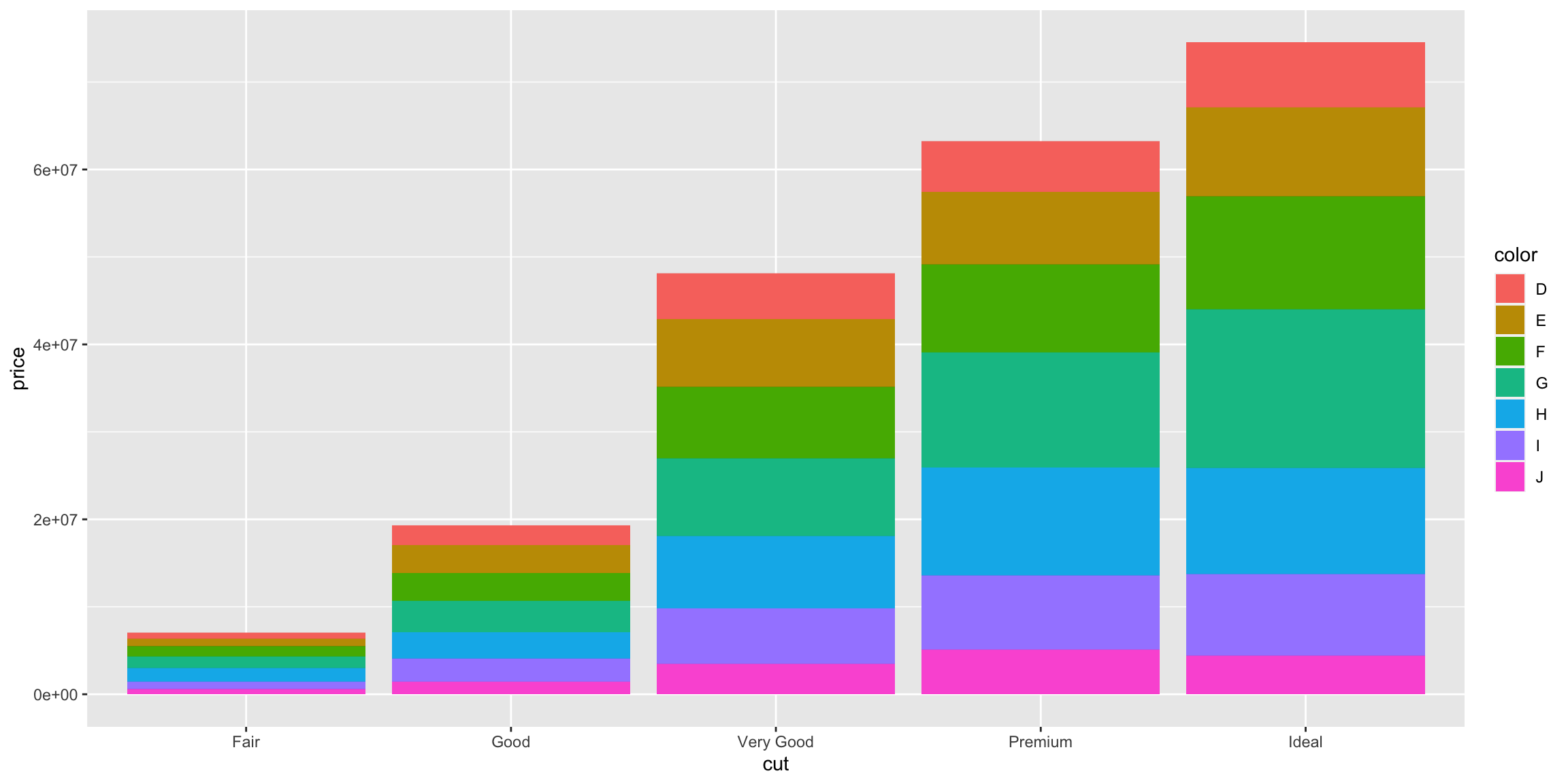
Defaults are almost always terrible.

Issues with the preceding

  • Colours are awful
  • Grey background is distracting
  • Text size is too small
  • Legend position on the side is strange?
  • Numbers on the y-axis are nonesense
  • With barchart, y-axis should start at 0.
  • .png vs .svg

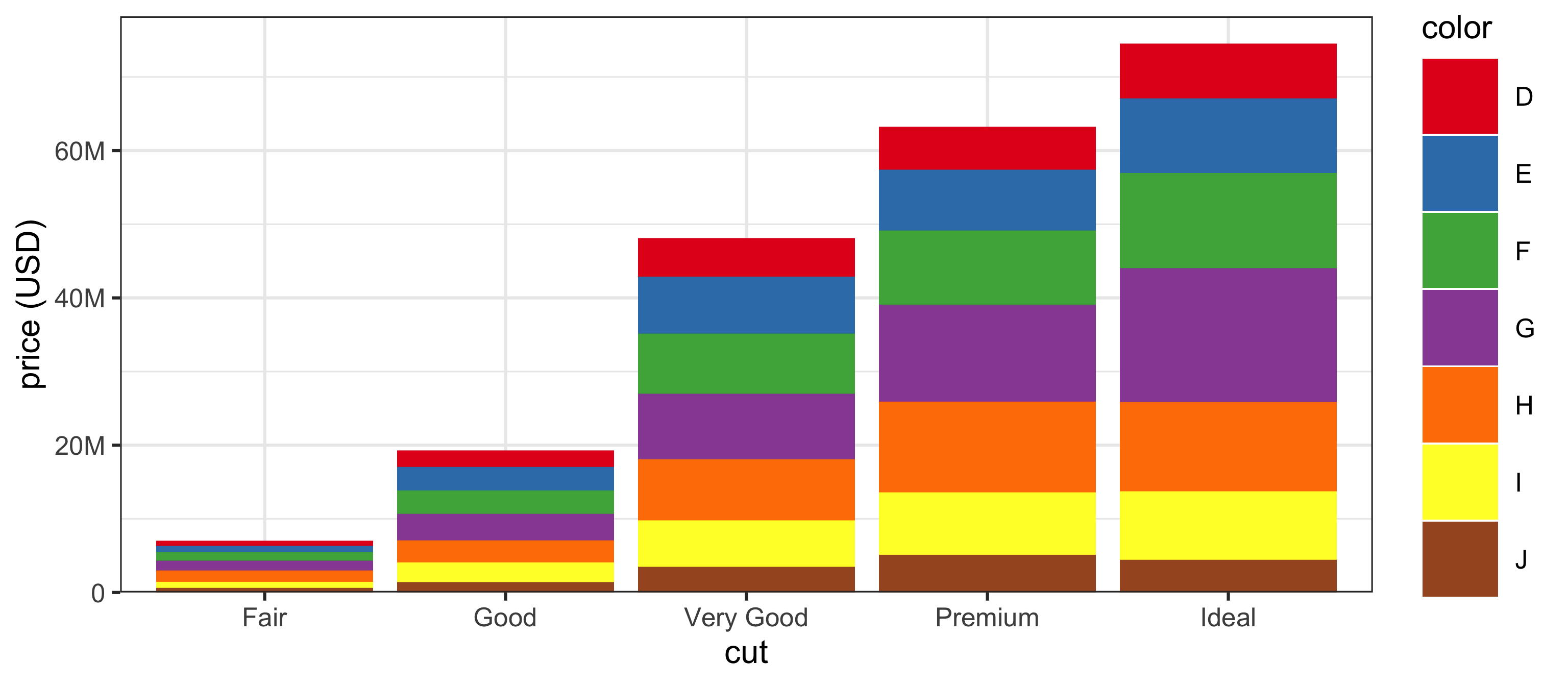
Graphics

Again

Tip

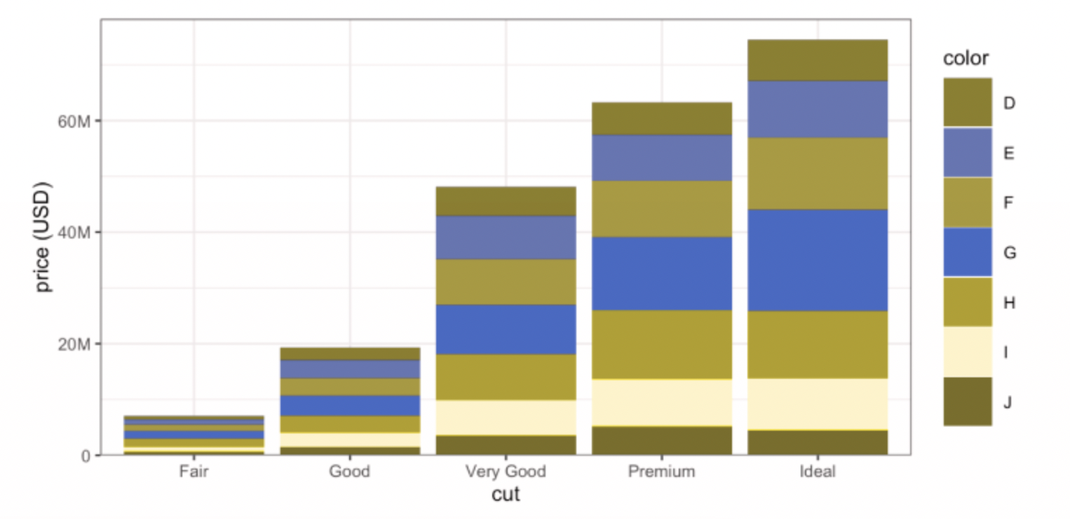
I like this, but ~10% of men are colour blind (including some faculty in this department).

Simulation

Jargon

  • Be wary of acronyms (MLE, BLUP, RKHS)
  • Again, think of your audience. MLE is fine for any statistician.
  • Others need definitions in words and written on the slide
  • Same for math notation \(\bar{X},\ \mu,\ \sigma,\ \mathbf{UDV}^\top\)
  • And for applied work e.g. SNP

Things I hate

Saying “I’m not going to talk about …” “I’m happy to discuss … later if you’d like”.

Wiggling your laser pointer at every word. Highlight important things with pretty colours. Use pointer sparingly.

Playing with your collar, your pockets, your water bottle…

Staring at your slides …

Displaying the total number of slides as in 6/85 in the lower right hand corner …

Running over time. Skipping 6 slides to desperately make the time limit.

Using the default themes:

Never use tables of numbers

  • Economists do this all the time for inexplicable reasons
  • I rarely put these in papers either
  • If I’m not going to talk about it, it doesn’t go on the slide
  • There’s no way I’m going to read off the number, certainly not to 4 decimal places
  • Use a graph

  • A graph with 3 dots should be a table of 3 numbers.
  • But why do you have only 3 numbers?
  • Any table can be a better graph.

Ask yourself:

Is this the best way to display the data? Have I summarized too much?

Things you should do

Number your slides

Have lots of prepared backup slides (details, answers to potential questions, further analysis)

Practice a lot. Practice in front of others. Practice the beginning more than the rest.

BE EXCITED. You worked hard on this. All results are cool. Play them up. You did something good and you want to tell everyone about how awesome you are. Own it.

Take credit. Say “I showed this” not “It can be shown”.

Things that are debatable

  • Math talks tend to be “chalkboard”
  • CS talks tend to be “sales pitch”
  • Stats is in the middle.
  • I lean toward details with elements of salesmanship
  • If I hear your talk, I want to be able to “do” what you created. This is hard without some math.
  • This also colours my decisions about software.

Note

Jeff Bezos banned Powerpoint from Amazon presentations

Closing suggestions

Slow down

  • Get a bottle of water before the talk. Drink it to pause on (pre-planned) key slides.
  • This will help you relax. It will also give the audience a few seconds to get the hard stuff into their head.

Cut back

  • Most of your slides probably have too many words.
  • And too much “filler” –> Kill the filler

Try to move

  • It’s good to move physically, engage the audience
  • Try to make eye contact with the whole room
  • Record yourself once to see if you do anything extraneous

Have fun.