Lecture 4: Data Visualization with ggplot2
STAT 545 - Fall 2025
Part 1: Plotting in R with ggplot2
Today’s Goals
create effective data visualizations
explore the grammar of
ggplot2
Quick links:
Required Packages
Install (if necessary) and load in the following packages:
Motivating Example
We want to investigate if there is a relationship between the number of cylinders (cyl), fuel efficiency (mpg), and horsepower (hp) in the mtcars data set.
Motivating Example
- Was it easy to figure out the relationship I was trying to convey?
- What about through a plot?
Motivating Example
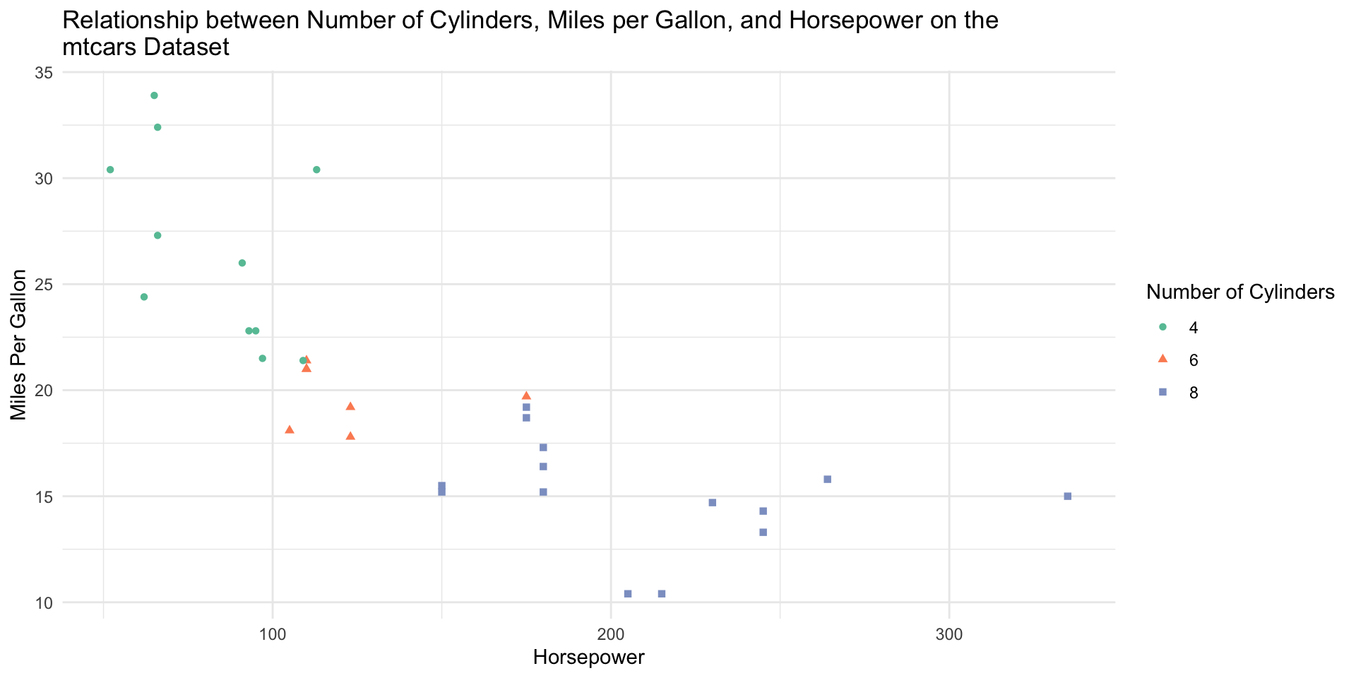
Motivating Example
We can clearly see that cars with higher horsepower tend to be less fuel efficient (have lower miles per gallon).
Cars with higher horsepower also tend to have a higher number of cylinders.
That was a lot easier to deduce than when we were reading numbers off of a large table. We will show how to build this exact plot in this lecture!
Effective Data Visualization
Data visualizations are often preferred to aid with identify patterns and relationships and emphasizing important findings in a research projects
- This is especially true for presentations
So, what’s the best visualization?
- Depends on what you need the data visualization to answer!
Once you know what you want to show, we need to convey the message as clearly and simply as possible
Effective Data Visualizations: Considerations
Make it clear as a “standalone”
- Use labels, titles, and legends and make them informative and clear
Minimize noise
Don’t use colours randomly - it may cause us to see false patterns
Don’t overlap plots
Use as few plots as possible, but don’t be afraid to separate data to plot if it makes things clearer
Consider the accessibility of your chart
up to 10% of the population has colourblindness
make it low-vision friendly and provide descriptions where possible
ggplot2 and the Grammar of Graphics
ggplot2 is based on the grammar of graphics, which is a systematic approach for describing different components or aspects of a graph. It involves seven components (required components are indicated with the *):
Data*
- the data you’re feeding into the plot, perhaps a tibble or dataframe
Aesthetic mappings*
- a specification of how you will connect variables (for example, horizontal or vertical positioning, grouping, size, colour, shape)
Geometric objects*
- a specification of what the object will be drawn as (for example, a scatter plot, line, bar chart)
* = required component
ggplot2 and the Grammar of Graphics
Scales
- a specification of how a variable is mapped to its aesthetic
Statistical transformations
- a specification of whether and how the data are combined or transformed. For example, is a bar chart plotting the values or a relative frequency?
Coordinate system
- a specification of how the position aesthetics (x and y) are depicted in the plot. We typically use cartesian coordinates, though polar coordinates are also possible.
Facet
- a specification of data variables that partition the data into smaller “sub plots” or panels
It’s okay if you don’t quite understand all of these components yet. We will walk through examples of commonly used plots and discuss which components are necessary!
Example: Scatterplot on mtcars
Let’s say you’d like to see if there is a relationship between miles per gallon and horsepower of cars in the mtcars data set. As both of these variables are numeric, we could build a scatterplot as we are comparing two quantitative/numeric variables.
Example Scatterplot on mtcars
Let’s say you’d like to see if there is a relationship between miles per gallon and horsepower of cars in the
mtcarsdata set. As both of these variables are numeric, we could build a scatterplot (more on this next class).The
ggplot()function takes two arguments:data(the data frame or tibble containing your data that you’d like to plot)mapping(aesthetic mappings applied to the entire plot. We use theaes()function inside of this argument.).
Example Scatterplot on mtcars
Let’s start building the scatterplot! Let’s plot mpg (miles per gallon) on the x axis and hp on the y axis by piping the dataset into the ggplot function:
Notice that we haven’t actually plotted anything! ggplot doesn’t know what type of plot we want to draw, only that we want mpg on the x axis and hp on the y axis from the mtcars data we provided.
Example Scatterplot on mtcars
To tell ggplot that we want a scatterplot, we are going to add a layer to the plot using the + at the end of the previous line. geom_point() is the geometric object we’d like to add (i.e., a scatterplot):
We now have created a scatterplot! It’s fine, but we can elevate this.
Example Scatterplot on mtcars
Let’s colour the points by the number of cylinders!
Note: because cyl is written as a number, R is probably going to read it as a numeric value. However, we only have three possible categories for the number of cylinders, so we first should tell R to treat this as a categorical variable!
Example Scatterplot on mtcars
We can treat cyl as a categorical variable with mutate, where we overwrite the cyl variable as a factor. Then, we use color = cyl in the aes() function to tell ggplot to colour by this category!
Cool! But… this isn’t super colourblind-friendly.
Example Scatterplot on mtcars
Let’s turn to the RColorBrewer package to select a friendlier colour scheme. The colour palette “Set2” is more colourblind-friendly:
Example Scatterplot on mtcars
To be even more accessible, let’s change the shape of the points by cylinder type by adding shape = cyl to the aes()!
Example Scatterplot on mtcars
Now, let’s add better labels to our X and Y axes:
Example Scatterplot on mtcars
We can also change the title of our legend. We’ll have to specify the title twice as we’ve grouped by colour and shape:
Example Scatterplot on mtcars
The grey background is still a bit distracting, so we could remove it by giving out ggplot a more minimal theme:
Example Scatterplot on mtcars
And finally, let’s add a descriptive title!
Now, this is a nice visualization! We can clearly see that cars with higher horsepower tend to be less fuel efficient (have lower miles per gallon). Cars with higher horsepower also tend to have a higher number of cylinders.
Example Scatterplot on mtcars
Tip
The \n in the title is a special character that allows the line to break and fit on this size of plot.
Names of axes should have quotations “” around them.
The order of the layers doesn’t matter after the geom_layer() layer.
Advice for ggplot
Google is absolutely your friend when building
ggplots.I don’t think I’ve ever made a plot without googling how to do it.
ggplotis extremely powerful, flexible, and a bit scary to learn!If you need to build a plot, search it! Need to plot two histograms, separated by groups (say, gender), side by side? I’d google: “ggplot histogram grouped by variable”. This brings me to this blog post by R Charts that has a TON of different side by side histograms with code!
ggplotis very much a “learn by doing” skill.
Part 2: Choosing a Visualization
Choosing a Visualization
Ask a question, then answer it
The purpose of a visualization is to answer a question about a dataset of interest.
A good visualization answers the question clearly. A great visualization also hints at the question itself.
Designing a Visualization
Visualizations alone help us answer two types of questions:
- descriptive: What are the largest 7 landmasses on Earth?
- exploratory: Is there a relationship between penguin body mass and bill length?
inferentialpredictivecausalmechanistic
(we need more tools + visualizations to answer the others)
Types of Variables
A variable refers to a characteristic of interest and can be:
- Categorical: can be divided into groups (categories) e.g. marital status
- Quantitative: measured on a numeric scale (usually units are attached) e.g. height
The types of variables (along with the question we wish to answer/explore) we have may depict the type of data visualization we should use.
Scatter Plots
Scatterplots are used to visualize the relationship between two quantitative variables
- Example: Is there a relationship between horsepower and fuel economy of an engine? Does the number of cylinders affect that relationship?
The scatterplot we made last class helped us determine that there was a relationship between these three variables!
Line Plots
Line plots are used to visualize trends with respect to an independent quantity
- Example: How has atmospheric carbon dioxide changed over the last 40 years?
Bar Plots
Barplots are used to visualize the comparison of amounts
- Example: Which are the largest 12 island landmasses on Earth? Are they all continents or are there some other islands with large landmasses as well?
Histograms
Histograms are used to visualize the distribution of a single quantitative variable
- Example: Was there a difference in life expectancy across different continents in 2016?
Other Visualizations
This list is not exhaustive, but the following are banned from this class:
anything “3D”
pie charts
To Save These Slides With Your Code
To Print to PDF (with your code!), do the following:
Open the in-browser print dialog
CMD/CTRL + Por Right click > PrintChange the Destination setting to Save as PDF.
Change the Layout to Landscape.
Change the Margins to None. Enable the Background graphics option.
Click Save 🎉
In all cases, ensure the code chunks don’t get cut off (i.e., a line is too long). You will not be able to edit these from the PDF directly (though you could open the slides again and copy-and-paste to re-run the code!)