library(fivethirtyeight)
library(tidyverse)Lecture 5: Tidy Data and the Tidyverse
September 30, 2025
Learning Objectives
From this topic, students are anticipated to be able to:
recognize whether a given data set is ‘tidy’ or ‘untidy’ for their analysis
understand why ‘tidy’ data can be useful
reshape a data set between ‘long’ and ‘wide’ formats, using
tidyr::pivot_longer()andtidyr::pivot_wider()understand how to grapple with explicit missing values created by pivoting
Lecture Video
Lecture Slides
Set Up
We will be using the following packages for this lecture:
Tidy Data and the Tidyverse
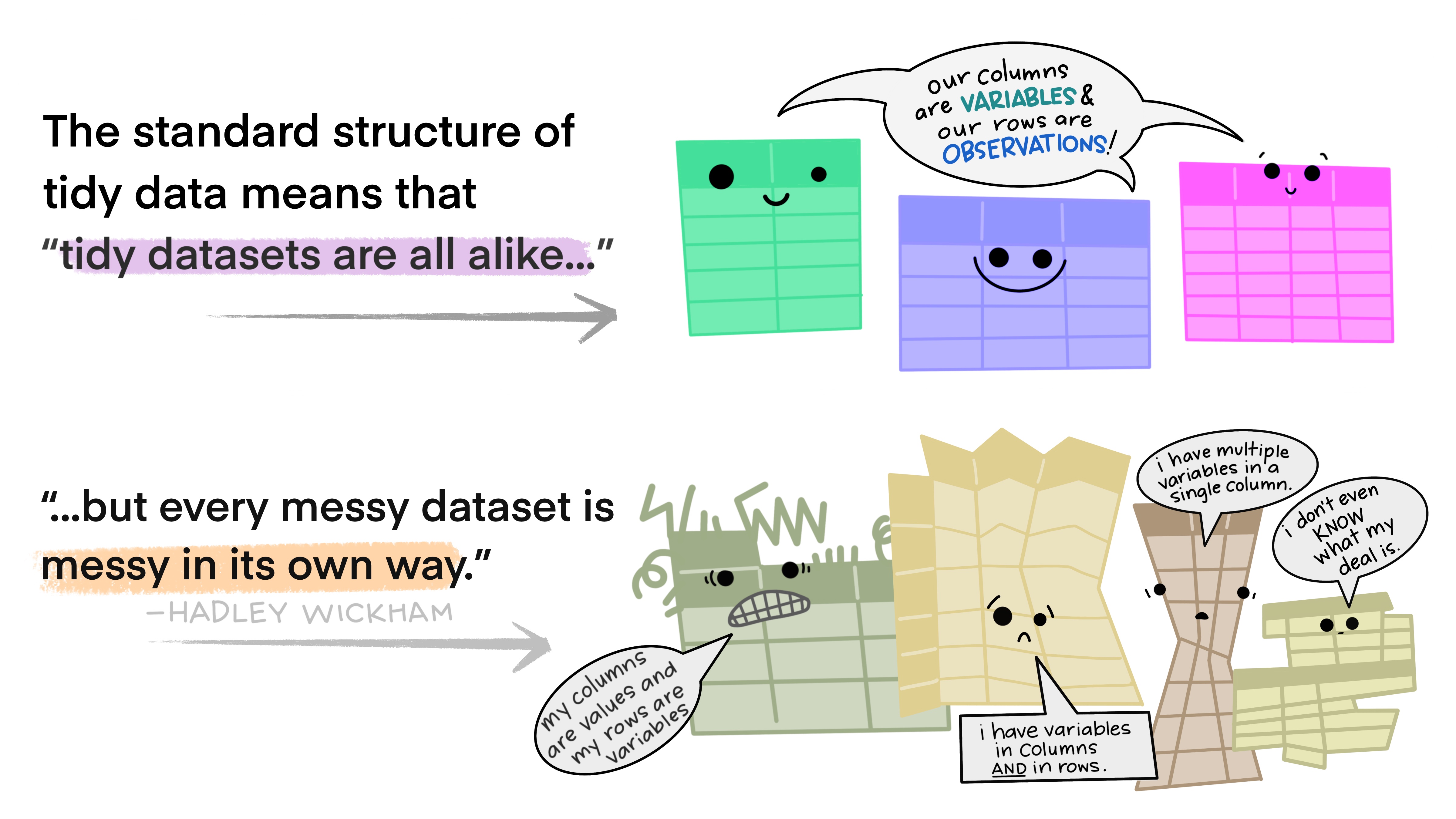
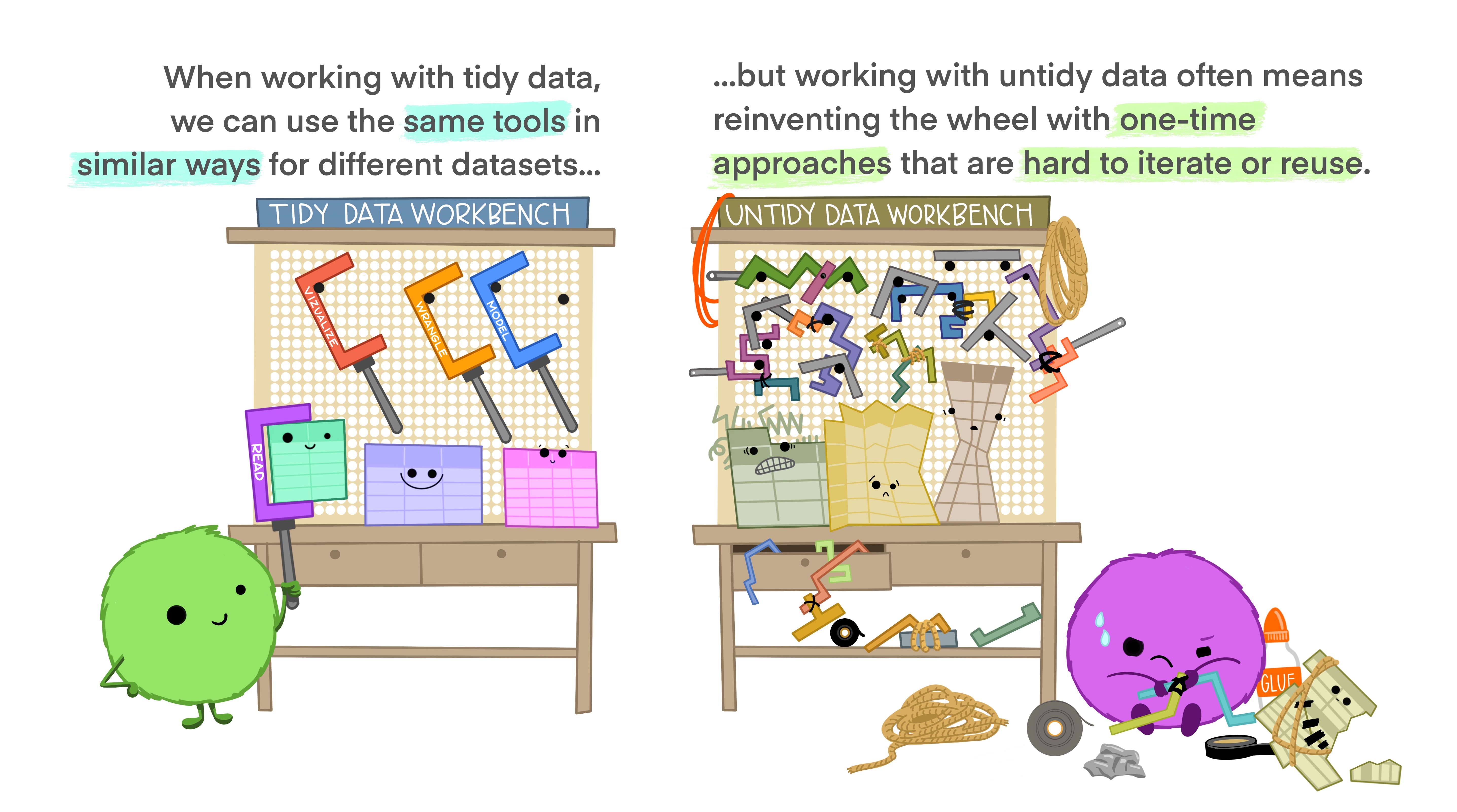
In the last two weeks, we learned about the dplyr package for data manipulation and the ggplot2 package for graphing. These two packages are part of the “tidyverse”: a collection of data science packages that are designed to have input data frames and output data frames that are tidy. In fact, we can load all packages in the tidyverse at once with the single command library(tidyverse).
Here, we are using the word “tidy” in a technical sense - we’re not talking about how “neat” or “organized” your data is. Instead, “tidy” is a very specific set of rules for storing data.
Tidy data is defined as data where
each variables form a column,
each observation forms a row, and
each cell is a single measurement. [1]
So why do we want to use it?
For example, the following data set containing cat and dog names by family is not tidy. We have multiple observations per row (a cat, and a dog observation):
| Owner | Pet 1 | Pet 2 |
|---|---|---|
| Asfar | Cosmo (Orange Cat) | Zuko (Grey Dog) |
| Grace | Dorito (Brown Chipmunk) | |
| Zifu | Booger (Black and White Dog) | |
| Flora | Mimi (White Cat) | |
| Yvette | Mia (Beige and White Cat) | |
| Alexandra | Bambi (Black and White Dog) | |
| Erick | Maisy (Brown Cat) | |
| Solana | Suki (White and Brown Cat) | |
| Danielle | Enzo (Black Cat) | |
| Kisa | Rio (Multicoloured Parrot) |
Instead, a tidy version of this data set may look like this:
| Pet Name | Type | Owner | Colour |
|---|---|---|---|
| Cosmo | Cat | Asfar | Orange |
| Zuko | Dog | Asfar | Grey |
| Dorito | Chipmunk | Grace | Brown |
| Booger | Dog | Zifu | Black and White |
| Mimi | Cat | Flora | White |
| Mia | Cat | Yvette | Beige and White |
| Bambi | Dog | Alexandra | Black and White |
| Maisy | Cat | Erick | Brown |
| Enzo | Cat | Danielle | Black |
| Rio | Parrot | Kisa | Multicoloured |
Each row is an observation, each variable is a column, and each cell is a single measurement. Our data is tidy!
All of the data we used before this week were already tidy. This made it easy to use the tidyverse packages dplyr and ggplot2 to do what we needed to do. Oftentimes however, data is not collected in a tidy way. So, what happens do we do when we have untidy data? Let’s explore it!
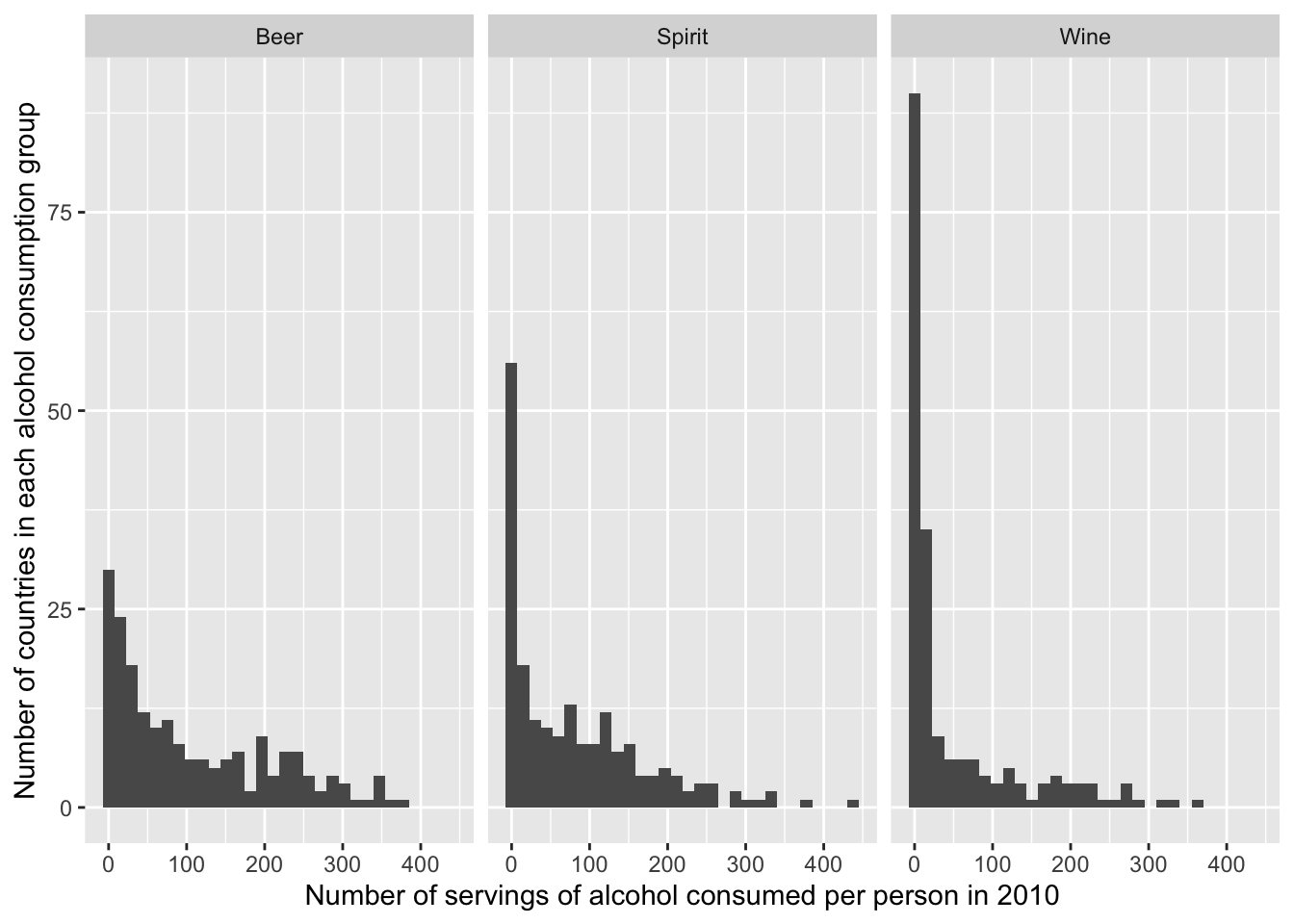
Example: Drinks
The fivethirtyeight R package contains a dataset called drinks. This dataset was compiled as part of a FiveThirtyEight article that explored (among other things) which countries consumes the most alcohol. Let’s look at a subset of the data:
drinks_tbl1 <- as_tibble(drinks) %>%
  select(-total_litres_of_pure_alcohol) #remove total liters variable

head(drinks_tbl1) #view the first few rows of the data
# A tibble: 6 × 4
country beer_servings spirit_servings wine_servings
<chr> <int> <int> <int>
1 Afghanistan 0 0 0
2 Albania 89 132 54
3 Algeria 25 0 14
4 Andorra 245 138 312
5 Angola 217 57 45
6 Antigua & Barbuda 102 128 45The following graphic was made from the drinks dataset.
It’s clear from the definition that tidiness is an attribute of a dataset. But did you know that tidiness also depends on what you are planning to do with the data? That’s because what’s an observation and what’s a variable depends on the data analysis plan!
Basic Pivoting
Once you have figured out what’s tidy for you, you may come to realize that your data is not tidy. As we have discussed, it will typically save you time and frustration to tidy it before moving on in your analysis.
Very often this will involve using “pivoting” type functions. For example, the tidyr package in the tidyverse has two main pivoting functions:
pivot_longer()makes datasets longer: it moves some information in the columns into new rows, thereby increasing the number of rows of the dataset.pivot_wider()makes datasets wider: it moves some information in the rows into new columns, thereby decreasing the number of rows of the dataset.
Pivoting Wider
Here is an example of (artificial) data that is currently in “long” format, looking grades before and after active learning was incorporated into their math and science lectures:
grades_long <- tibble(
  student_id = c(1, 1, 1, 1, 2, 2,2, 2, 3, 3, 3, 3),
  time = c("Before", "After", "Before", "After", "Before", "After", "Before", "After", "Before", "After", "Before", "After"),
  subject = c("Math", "Math", "Science", "Science", "Math", "Math", "Science","Science",  "Math", "Math", "Science", "Science"),
  score = c(85, 86, 92, 92, 78, 82, 88, 89, 95, 94, 90, 90)
)

head(grades_long)
# A tibble: 6 × 4
student_id time subject score
<dbl> <chr> <chr> <dbl>
1 1 Before Math 85
2 1 After Math 86
3 1 Before Science 92
4 1 After Science 92
5 2 Before Math 78
6 2 After Math 82Sometimes, we require data involving time to have row for each observation, and one column for each time point (i.e., wide data). While this isn’t our “standard” definition of tidy, sometimes this is what is required for longitudinal data (i.e., data involving measures repeated over time). Nevertheless, let’s try to pivot this table!
We can solve this problem using pivot_wider, which needs three pieces of information.
What is a set of columns that uniquely identifies each observation? Put their names in the
id_colsargument.Where should the names for the new columns come from? Put the name of the column you want to take the new variable names from in the
names_fromargument.What values should the new columns contain? Put the name of the columns you want to take the values from to
values_fromin thevalues_fromargument.
Note that if you don’t specify an id_cols argument, pivot_wider will assume that you want it to be every column except those in names_from and values_from. Further, any columns not included in id_cols, names_from, and values_from (e.g., ep_id) will simply be dropped.
We can pivot the grades_long table wider so that we have a columns “Scores_Before” and “Scores_After” for each student_id and subject:
grades_wide <- grades_long %>% #assign new variable
  pivot_wider(names_from = time, #get column names from time
              values_from = score, #fill in values from score
              names_prefix = "Scores_") #add "scores_" to new column names

head(grades_wide)
# A tibble: 6 × 4
student_id subject Scores_Before Scores_After
<dbl> <chr> <dbl> <dbl>
1 1 Math 85 86
2 1 Science 92 92
3 2 Math 78 82
4 2 Science 88 89
5 3 Math 95 94
6 3 Science 90 90Pivoting Longer
The Basics: Column Names Contain Variable Values
Here is a snippet of WHO data on the number of tuberculosis cases in different years in different countries.
# A tibble: 3 × 3
  country     `1999` `2000`
  <chr>        <dbl>  <dbl>
1 Afghanistan    745   2666
2 Brazil       37737  80488
3 China       212258 213766
IIf we wanted to compare tuberculosis cases over time by country (e.g. by plotting the year on the x-axis and case count on the y-axis with a line for each country), then this format is not tidy. There should be one observation per unit within each population (country-years). In this case, we do not observe units within each country-year, so each observation is a country-year. The variables then fall into place: the country and year labels, and the case counts.
(Aside: if we had measured more data, then perhaps there would be more units within each population! Imagine if we had case-level information, like severity. Then we could view cases as observations within the country-year populations, and we would have variables like country, year, case ID, and severity.)
So the tidy format here puts the variables (the year, the country, and the case counts) on the columns. There are 6 rows, one for each unique country-year combination. In this example, the tidy format is longer. That means to produce it using who_wide, we need to lengthen it by moving some information in the column names (the info about the measurement year) into new rows.
We can solve this problem using pivot_longer, which needs three pieces of information.
Which are the columns that we want to expand into more rows? Put their names in the
colsargument.We want to save the information in the names of those columns as values in new column(s) of our dataset. What should we name these new column(s)? This is the
names_toargument.We also want to preserve the information in the values of those columns - so we should save them as values in a new column of our dataset. What should we name it? This is the
values_toargument.
who_long <- who_wide %>% pivot_longer(cols = c('1999', '2000'), #pivot these columns
                         names_to = "year", #new column name is year
                         values_to = "cases") #use cases as the values of the column

who_long
# A tibble: 6 × 3
country year cases
<chr> <chr> <dbl>
1 Afghanistan 1999 745
2 Afghanistan 2000 2666
3 Brazil 1999 37737
4 Brazil 2000 80488
5 China 1999 212258
6 China 2000 213766Now our data is tidy!
Example: Column Names Contain Multiple Variable Values
Here’s a more realistic (but still simplified) look at the WHO Tuberculosis data.
who_demo <- who2 %>%
  select(country, year, starts_with("sp")) %>%
  rename_with(function(x)
    str_remove(x, pattern="sp_"),
    starts_with("sp")) %>%
  filter(year %in% c(1999, 2000)) %>%
  filter(country %in% c("Afghanistan", "Brazil", "China"))

head(who_demo)
# A tibble: 6 × 16
country year m_014 m_1524 m_2534 m_3544 m_4554 m_5564 m_65 f_014 f_1524
<chr> <dbl> <dbl> <dbl> <dbl> <dbl> <dbl> <dbl> <dbl> <dbl> <dbl>
1 Afghanistan 1999 8 55 55 47 34 21 8 25 139
2 Afghanistan 2000 52 228 183 149 129 94 80 93 414
3 Brazil 1999 301 3662 5401 5827 4630 2634 2121 372 2909
4 Brazil 2000 1894 7268 11568 11906 8623 5085 4494 1859 6719
5 China 1999 1247 18961 29328 25095 24239 21564 21367 1431 15178
6 China 2000 1131 19111 29399 25206 25593 21429 21771 1420 14536
# ℹ 5 more variables: f_2534 <dbl>, f_3544 <dbl>, f_4554 <dbl>, f_5564 <dbl>,
# f_65 <dbl>This time, cases are broken down by gender (f/m) and by age range (014\1524\2534\3544\4554\5564\65).
Suppose now that we are interested in comparing tuberculosis rates over time across (potentially) gender, age, and country. Then the most granular population we are trying to describe is a country, gender, age, and year combination, and like in the last example, we have no measured sub-units within that population, so an observation is a unique combination of country, gender, age, and year. (What a mouthful!)
Once we’ve sorted that out, the variables fall into place: country, year, gender, age range, and case count. Values for gender and age range are currently located in the column names of who_demo, and values for case count are currently spread across multiple columns. So to tidy who_demo up, we need to use pivot_longer() to move the info in the columns into new rows.
Conceptually, this is pretty similar to the last example: we want to use the information in m_014, m_1524, etc. to create new rows. So we should put those column names into the cols argument. But now, we want the information in their column names - the gender and age - to go into two new columns: gender and age. We can do this by specifying two column names in the names_to argument: gender and age.
But how is pivot_longer() to know which part of the column name m_014 corresponds to the gender, and which part corresponds to the age? You need to tell it that the pieces of information are separated by the “_” character using the names_sep argument.
Finally, we can specify the name of the new column we want the values in the m_014, m_1524, etc. columns to go into with the values_to argument.
who_demo %>% pivot_longer(cols = !(country:year), # all columns aside from country to year
                          names_to = c("gender", "age"), #new columns named age and gender
                          names_sep = "_",#current gender and age are a single variable separated by _
                          values_to = "cases") #use the cases column for the values
# A tibble: 84 × 5
country year gender age cases
<chr> <dbl> <chr> <chr> <dbl>
1 Afghanistan 1999 m 014 8
2 Afghanistan 1999 m 1524 55
3 Afghanistan 1999 m 2534 55
4 Afghanistan 1999 m 3544 47
5 Afghanistan 1999 m 4554 34
6 Afghanistan 1999 m 5564 21
7 Afghanistan 1999 m 65 8
8 Afghanistan 1999 f 014 25
9 Afghanistan 1999 f 1524 139
10 Afghanistan 1999 f 2534 160
# ℹ 74 more rowsExample: Column Names Contain Variable Names And Values
So far we have seen examples where the column names contain variable values. But what if they contain names AND values?
Let’s have a look at the household dataset (loaded with the tidyr package), which has the date of birth and names of two children in families. Let’s say that we wanted to investigate how children names relate to their date of birth.
head(household)# A tibble: 5 × 5
family dob_child1 dob_child2 name_child1 name_child2
<int> <date> <date> <chr> <chr>
1 1 1998-11-26 2000-01-29 Susan Jose
2 2 1996-06-22 NA Mark <NA>
3 3 2002-07-11 2004-04-05 Sam Seth
4 4 2004-10-10 2009-08-27 Craig Khai
5 5 2000-12-05 2005-02-28 Parker Gracie We are trying to learn about the population from which these children belong; it is hard to say precisely what that is without having more information about how this data was collected, but it is likely something like “all children living in a particular place in a particular year”. The units in this population are children. So to tidy this data, we’d want “date of birth” and “name” to be two variables/columns associated with an observation/row (a child). We know we want to use pivot_longer(), because we want to make household longer by creating new variables. But wait! The names of the “date of birth”/“name” variables AND the values of the “child” variable are BOTH in the column names of household!
Inspecting the documentation for pivot_longer() very carefully reveals that you can use a special specification of the names_to argument to resolve this problem.
household %>% pivot_longer(cols = -family, # all columns except family
                           names_to = c(".value", "child"), #change column names, .value is a placeholder
                           names_sep = "_") # dob and child are currently separated by _ in one single variable
# A tibble: 10 × 4
family child dob name
<int> <chr> <date> <chr>
1 1 child1 1998-11-26 Susan
2 1 child2 2000-01-29 Jose
3 2 child1 1996-06-22 Mark
4 2 child2 NA <NA>
5 3 child1 2002-07-11 Sam
6 3 child2 2004-04-05 Seth
7 4 child1 2004-10-10 Craig
8 4 child2 2009-08-27 Khai
9 5 child1 2000-12-05 Parker
10 5 child2 2005-02-28 GracieThe special ".value" specification says that we want to use the first component of the pivoted column name as a variable name, and make a new column with values coming from the second component of the pivoted column name. The second thing we pass into names_to names that new column.
This process is best described by Figure 6.7 from R4DS.
But wait! Row 4 is a bunch of NAs! Does that mean this data isn’t tidy??
The fact that there is an NA does not necessarily mean that this data is untidy. To be clear: for the purpose of the tidy data definition, an indicator for a missing value is a value.
Whether this data is untidy depends on the data context. Essentially, the question we should ask is: “Is row 4 an observation that we are missing information about? Or is it simply an artifact of our pivoting procedure?”
Suppose this study was designed to only sample families with two children. Then, row 4 could be a real observation that we are missing information about: family 2 should have only been included if they had two children. Perhaps this reflects family 2 filling out a survey that asks them the number of children (in which they listed 2), but then getting distracted and forgetting to fill out the information for their second child. In this case, our data is tidy, and the tidy data format is a real advantage: it reveals missing information in our data set that was not obvious from the original untidy format.
Now suppose this study just samples families at large. We know from experience about the world that some families have one children, some families have two, and some families have more. Then, it seems possible that row 4 is not a real observation: family 2 might just have a single child. In this case, we have a row for something that is not an observation, so we would like to tidy up by dropping it. We could actually have done this by altering our original pivot_wider() call as follows:
household %>% pivot_longer(cols = -family,
                           names_to = c(".value", "child"),
                           names_sep = "_",
                           values_drop_na = TRUE) #remove NAs
# A tibble: 9 × 4
family child dob name
<int> <chr> <date> <chr>
1 1 child1 1998-11-26 Susan
2 1 child2 2000-01-29 Jose
3 2 child1 1996-06-22 Mark
4 3 child1 2002-07-11 Sam
5 3 child2 2004-04-05 Seth
6 4 child1 2004-10-10 Craig
7 4 child2 2009-08-27 Khai
8 5 child1 2000-12-05 Parker
9 5 child2 2005-02-28 GracieThis discussion highlights the importance of knowing the context in which your data is collected for tidying (and for your analysis at large). Here and elsewhere, it really pays to be in close contact with the people who generated your data.
Separating and Uniting
Sometimes data has multiple pieces of information stored in a single column. To separate them into two distinct columns, we can use the separate() function from the tidyverse (technically, a package within tidyverse called tidyr.
separate(): separates information within a column. It involves three arguments:
col: specifies the column we want to separateinto: specifies the names of the new columns.sep: specifies where we want to cut. The default is pretty clever - it separates at any non-alphanumeric value. (How this is accomplished involves regular expressions, which are very useful when working with character data. We will learn more about regular expressions in STAT 545B. )
Conversely, unite() combines information from two or more columns into one. Involves:
col: name of the new column...: the names of columns to be unitedsep: specifies the separator to use between values (i.e., “-”)
table3 <- tibble(country = c("Afghanistan", "Afghanistan", "Brazil", "Brazil", "China", "China"),
                 year = c(1999, 2000, 1999, 2000, 1999, 2000),
                 rate = c("745/19987071", "2666/20595360", "37737/172006362",
                          "80488/174504898", "212258/1272915272", "213766/1280428583"))

table3
# A tibble: 6 × 3
country year rate
<chr> <dbl> <chr>
1 Afghanistan 1999 745/19987071
2 Afghanistan 2000 2666/20595360
3 Brazil 1999 37737/172006362
4 Brazil 2000 80488/174504898
5 China 1999 212258/1272915272
6 China 2000 213766/1280428583The rate column contains the values of two variables: case counts and population counts. We would like to snip it apart at the “/” character to create two columns:
table5 <- table3 %>% separate(col = rate,
                    into = c("cases", "population"))
table5
# A tibble: 6 × 4
country year cases population
<chr> <dbl> <chr> <chr>
1 Afghanistan 1999 745 19987071
2 Afghanistan 2000 2666 20595360
3 Brazil 1999 37737 172006362
4 Brazil 2000 80488 174504898
5 China 1999 212258 1272915272
6 China 2000 213766 1280428583The col argument specifies the column we want to separate, and the into argument specifies the names of the new columns. The sep argument (not specified here) specifies where we want to cut. The default is pretty clever - it separates at any non-alphanumeric value. (How this is accomplished involves regular expressions, which are very useful when working with character data. We will learn more about regular expressions in STAT 545B. )
The Merits of Untidy Data
As we’ve seen, tidy data is often very helpful. But there are also times when untidy data is good. Here are a few reasons:
The format that lends itself best to fast computations might not be tidy. Case Study: Tidy Genomics.
Untidy data is often easier for humans to interpret and edit. See Untidy Data: The Unreasonable Effectiveness of Tables.
We could lose important information about the context in which the data was collected by cleaning and tidying raw data. This can have important ethical implications; see Chapter 5 of the book “Data Feminism” by Catherine D’Ignazio and Lauren F. Klein.
In summary, tidiness is a very useful concept, and tidying data is often useful. But we should remember that absolutes are few and far between in data science and statistics. Just because tidying data is often useful, doesn’t mean it’s always useful.
Worksheet A4
Spend the rest of this class and next class working through Worksheet A4.
- Finished attempting all of the questions? Then do the optional R4DS Tidying reading, and maybe even do some of the exercises for extra practice.
Resources
Video Lecture: tidyr for Pivoting and Tidy Data
To learn how to use the
pivot_*()functions, consult tidyr’s pivot vignette.To get a better understanding of the concept of tidy data:
Hadley Wickham’s paper on Tidy Data is the gold standard treatment of tidy data.
A “code heavy” version of the tidy data paper is tidyr’s “Tidy Data” vignette.
Attribution
Albert Y. Kim inspired the in-class exercises using the drinks data set from fivethirtyeight. Allison Horst and Julia Lowndes created the illustrated tidy data series.
References
1.
Wickham H (2014) Tidy data. Journal of Statistical Software 59(10):1–23. https://doi.org/10.18637/jss.v059.i10